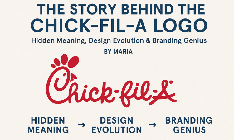
The Story Behind the Chick-fil-A Logo | Hidden Meaning, Design Evolution & Branding Genius
👩🍳 Hi, I’m Maria — Your Go-To Food Blogger from the U.S.
Hey fellow foodies! 👋 I’m Maria, a food blogger based in the USA who’s obsessed with more than just flavors—I’m passionate about the stories behind the brands we love. Today, I’m diving into one of the most iconic fast-food visuals of all time: the Chick-fil-A logo.
Sure, you’ve probably devoured their classic chicken sandwich, crispy nuggets, or those addictive waffle fries. But have you ever looked closely at the red “C” in the logo and thought, “Wait… is that a chicken’s head?” Well, you’re not alone! This seemingly simple design actually hides a story rich in creativity, history, and branding brilliance.
So grab a drink, settle in, and let’s explore the fascinating story behind Chick-fil-A’s logo—where every curve tells a tale. 🐔❤️
🔤 A Letter That Clucks: The Clever “C”
At first glance, the Chick-fil-A logo looks like stylish text. But take a closer look—the “C” in “Chick” has been uniquely stylized to resemble a chicken’s head.
It’s no coincidence.
-
🐓 The Comb: The top of the “C” has a small comb shape—like the one you’d see on a real chicken.
-
👁️ The Eye: Some versions have a small dot or detail that hints at an eye.
-
👄 The Beak: A curved line or serif placement mimics the chicken’s beak.
This isn’t just cute—it’s brand genius. Without even saying the word “chicken,” the logo already whispers it to you.
🐣 A Bit of History: From One Sandwich to a Symbol
Chick-fil-A’s story began in 1946 when Truett Cathy opened a small diner called the Dwarf Grill. But it wasn’t until 1967 that the first Chick-fil-A restaurant—and the official brand—was born.
From the beginning, the company was clear about one thing: it was all about chicken.
So when it came time to create a logo, the goal was to design something that:
✅ Stood out
✅ Spoke to its chicken roots
✅ Felt warm, welcoming, and family-friendly
The result? A friendly, red wordmark with a stylized chicken “C”—simple, but unforgettable.
🧠 Why This Logo Works
The Chick-fil-A logo isn’t flashy or overdesigned. But it works—and here’s why:
-
Simplicity: Clean lines and a minimal design make it instantly recognizable.
-
Memorability: That chicken head “C” sticks with you long after the meal is done.
-
Brand Alignment: The logo reinforces exactly what the restaurant is all about—chicken-first meals served with care.
-
Friendly Feel: The rounded type and playful character appeal to families, kids, and comfort-food seekers alike.
It’s the kind of logo that works just as well on a drive-thru sign as it does on a dipping sauce packet. That’s powerful branding!
🐄 And Then Came the Cows…
Now here’s where things get even more interesting.
If you’ve seen Chick-fil-A’s famous “Eat Mor Chikin” cows on billboards, you might assume they’re part of the logo. But surprise! They’re not.
Those lovable, misspelling cows first appeared in 1995 as part of a marketing campaign encouraging people to eat chicken instead of beef. Over time, they became mascots and pop-culture icons—but the official logo has always remained the red script with the chicken “C.”
So, while the cows made us laugh and won awards, the chicken kept clucking quietly in the logo all along.
🕰️ Logo Evolution: A Quick Look
Like any good brand, Chick-fil-A has fine-tuned its logo over time. But it’s always stayed true to its roots.
-
1960s–1980s: Hand-drawn, script-like text with more detail.
-
1990s–2000s: The chicken "C" became more refined and standardized.
-
2012–Now: A cleaner, more digital-friendly version—bolder lines, simplified elements, and consistent red coloring.
The tweaks were subtle but smart, ensuring the logo looks just as good on a phone screen as it does on a storefront sign.
🎨 Why Red & White?
Chick-fil-A’s colors aren’t just random.
-
🔴 Red = appetite, warmth, energy
-
⚪ White = cleanliness, simplicity, purity
Together, they create a brand palette that feels both comforting and high-quality. It’s inviting, family-friendly, and just bold enough to get your attention from a busy highway billboard.
🗺️ A Logo That Travels the World
As Chick-fil-A expands globally—from the U.S. to Canada, the U.K., and even Asia—the logo continues to serve as a familiar symbol of comfort food and southern hospitality.
It doesn’t need translation. A chicken is a chicken, and a good logo is a universal language.
🧭 Want to Spot One Near You?
If you’re craving that classic sandwich or want to see the logo in person, you can use the official Chick-fil-A locator tool:
👉 Visit the Chick-fil-A Restaurant Finder to explore locations and see what’s new in your area.
❤️ Final Cluck: A Logo with Legacy
So next time you unwrap your Chick-fil-A sandwich, take a look at that red “C.” What may seem like just a fancy font is actually a brilliant blend of design, purpose, and poultry.
It’s a logo that has stood the test of time—not just because it’s cute, but because it tells the brand’s story in one single character.
From my foodie heart to yours, I hope you never look at the Chick-fil-A logo the same way again. 😉
🙌 Like, Comment & Share!
💬 Did you ever notice the chicken head in the Chick-fil-A logo before reading this?
👍 Like this article if you’re a fan of clever design.
🔁 Share it with a fellow Chick-fil-A lover.
📝 Drop your thoughts in the comments—what other fast-food logos should I decode next?
Written by Maria — U.S. food blogger, design geek, and forever loyal to that spicy deluxe combo.


